Blog

  • arseniiv-math

    arseniiv-math

    Some mathematical stuff written in Ceylon.

    Import

    import name.arseniiv.math "0.1.5";
    

    At the moment, there is four packages:

    Common stuff in name.arseniiv.math.core

    There are tau (τ = 2π) and value of 1° in radians you can use to sensibly denote degree angle values:

    value rightAngle = 90 * degrees; // indeed 90°
    value hexagonAngle = 120 * degrees; // and so on…

    Also there is uniform pseudorandom generators for angles and integers, quadratic equation solver, and near-equality comparer for Floats.

    Complex numbers in name.arseniiv.math.complex

    Operations with complex numbers including basic elementary functions: exp, log, sin, cos, sinh, cosh. (See docs.)

    There is also several bits of code about Möbius transformations with correct handling of complex infinity.

    Rational numbers in name.arseniiv.math.rational

    Since 0.1.4.

    • Arithmetic, including integer powers.
    • Conversion to/from digit sequences: −248781 / 74 ↔ −3361.9(054), including non-decimal bases.
    • Approximation of Floats with given accuracy.
    • Conversion to/from continued fractions.
    • Vanity: egyptian fraction expansion, mediant.

    Quaternions in name.arseniiv.math.quaternion

    Here are the same elementary functions and basic arithmetic, and also functions to use quaternions in rotating 3D space.

    Rotations and vectors as quaternions

    You can represent a vector (x, y, z) simply as

    value v = Quaternion.vector(x, y, z);

    and rotations as special quaternion rotors which, for example, may be specified by rotation axis and angle:

    value rotor = Quaternion.rotor(someAxis, 0.25 * pi)

    Then you can simply compute rotor * vector * rotor.conjugate and get transformed vector, but there is more efficient route, so you better use

    value v2 = v.rotate(rotor);

    Composition of rotations represented by r1 and r2 is as simple as multiplication r2 * r1. You can also linearly interpolate between
    rotations using

    value rotorHalfway = slerp(rotorFrom, rotorTo)(0.5);

    Function slerp returns ‘interpolator’ of type Quaternion(Float) which can be used several times. At 0, it returns first rotor, and at 1, the second.

    See also Quaternions and spatial rotation in Wikipedia.

    Version history

    0.1.6

    • A small bugfix for Digits.fromRational.

    0.1.5

    • Remodularization: separate modules are back to being packages again. It seems they weren’t that big.

    0.1.4

    • Ceylon 1.3.3.
    • Rational numbers in name.arseniiv.math.rational.
    • Renamed Complex.unit and Quaternion.unit to respective ones.
    • Added sqrt for complex numbers and complex-valued quadratic solver.
    • Real quadratic solver slightly improved.
    • Number classes made final. Now you just can’t.
    • Added several missed tests.

    0.1.3

    • Quadratic equation solver, pseudorandom generators and some minor stuff added.
    • Ceylon 1.3.1 delivers static attributes, and I’ve thought of adding some.
    • Promoted packages to modules—now you can take only what you need (plus name.arseniiv.math.core).
    • Renamed module name.arseniiv.math to name.arseniiv.math.core.
    • Added tests for and more proper handling of Complex.infinity.
    • Fixed minor bugs in tests. 🙂

    0.1.2

    Hooray, Ceylon 1.2.1 delivers platform-independent math modules, so here are the changes!
    And I moved to another domain, too (my only excuse is this module is in beta :).

    0.1.1

    Now I’ve done version control the right way, and will never change master branch until another version is done.

    Also, now the thing is cross-platform and is using jvasileff’s XMath module. (If/as it will be merged in Ceylon language module, I’ll replace the import and up this module’s version number.)

    Known issues

    Currently not aware of. Write me if you see one. Feature suggestions are welcome too! So if you want these inverse trigonometric functions on complexes, please don’t be shy—I’m too lazy to demand them from myself.

    Visit original content creator repository
    https://github.com/arseniiv/arseniiv-math

  • rpm

    Visit original content creator repository
    https://github.com/plus3x/rpm

  • PointNet-FormulaStudent-I2R

    Formula Student car perception with PointNet 🏁 🔺 🔍

    Introduction

    This repository contains the code to support a study1 of the use of PointNet as perceiver in a Formula Student (FS) car. Here there are the tools to study the performance of this algorithm introduced in the perception pipeline of the FS team.

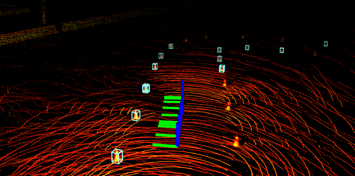
    The main task to solve with PointNet is the filtering of proposals received from the previous tasks of the pipeline. These proposals are regions of a point cloud2 with high probability to be a real cone. We use PointNet as a classifier with the aim of identifying only those proposals that are definitely cones.

    bounding_boxes_to_be_classified

    Usage

    You will need to have a database.sqlite3 and a validation_database.sqlite3 files in your data directory. Once you have the data, in order to train the model to classify the point clouds in the database run:

    cd src/models
    python train.py

    You can use Weights & Biases to track your train:

    python train.py --wandb_api_key "<wandb private api key>"

    You can also change hyperparameters as the time interval (delta), the sample size (num_points), the batch size (bs), the number of epochs (nepoch) and also reuse a previously trained model:

    python train.py --batchSize 128 --nepoch 10 --num_points 10 --delta 1000 --model ../models/cls_model-d:1000ms-sample:10-bs:128.pth

    For a simpler way to encapsule the process also useful for SLURM you can execute from the root:

    cd scripts
    ./train.sh

    Notebooks

    You can also find in the repository a directory with Notebooks useful for understanding the problem.

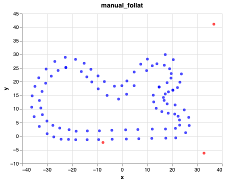
    • map_plot.ipynb is a notebook to visualize the tracks defined by the cones for each run. It also plots the no cones locations. Its outputs can also be found in notebooks/out/map_plot/.

    map_plot

    • data_understanding.ipynb allows us to generate a important plot for the research. This plot shows the average number of points in every bounding box with respect to its distance to the car.

    • cone_viz.ipynb shows the bounding boxes corresponding to cone locations as 3-dimensional scatter plots.

    • Finally, modelnet_viz.ipynb and pointnet_training.ipynb are used to visualize the meshes from the dataset ModelNet40 (and their samples), and to train PointNet with the data of ModelNet40, respectively.

    Footnotes

    1. Read the full study here.

    2. Received from a LiDAR sensor.

    Visit original content creator repository https://github.com/PauMatas/PointNet-FormulaStudent-I2R
  • workers-on-shared-hosting

    Workers on Shared Hosting

    The application allows to start, maintain, restart and stop workers on Shared Hosting.
    This is a solution in case there is no access to Supervisor, Systemd, etc.

    You can use cron to maintain workers.

    Installation

    Clone the repo and run it:

    composer install
    

    Requires at least PHP 8.3 and composer.

    Defining workers

    Create workers.yaml file:

    -
        name: AppWorker
        instances_number: 10
        working_directory: '/path/to/your/application'
        command: ['php8.3', 'bin/console', 'messenger:consume', 'async']
    -
        name: AnotherWorker
        instances_number: 1
        working_directory: '/path/to/your/application'
        command: ['python', 'worker_script.py']

    Command Line

    To start single worker:

    bin/console app:worker:start WorkerName
    

    To start all workers:

    bin/console app:worker:start-all
    

    To stop single worker:

    bin/console app:worker:stop WorkerName
    

    To stop all workers:

    bin/console app:worker:stop-all
    

    All available commands:

    Available commands for the "app" namespace:
      app:worker:restart      
      app:worker:restart-all  
      app:worker:start        
      app:worker:start-all    
      app:worker:stop         
      app:worker:stop-all  
    

    Maintaining workers using cron

    To make sure that workers are running, on a Shared Hosting server you can add the command app:worker:start-all
    to cron to run every minute. The command only creates workers if the processes are not running.

    If a process terminates unexpectedly, cron will resume it.

    This is a solution in case there is no access to Supervisor, Systemd, etc.

    Cron example:

    * * * * * cd /path/to/your/application && bin/console app:worker:start-all
    

    You can also restart workers at a specific time to protect yourself from hang state processes:

    0 3 * * * cd /path/to/your/application && bin/console app:worker:restart-all
    

    Testing

    Checking if the software is working properly on your server:

    composer test
    

    Copyrights

    Copyright © Rafał Mikołajun 2024.

    Visit original content creator repository
    https://github.com/mikoweb/workers-on-shared-hosting

  • IBM-Data-Analyst-Coursera

    IBM Data Analyst Professional Certificates

    About certificate:

    Gain the job-ready skills for an entry-level data analyst role through this Professional Certificate from IBM and position yourself competitively in the thriving job market for data analysts, which will see a 20% growth until 2028 (U.S. Bureau of Labor Statistics).
    Power your data analyst career by learning the core principles of data analysis and gaining hands-on skills practice. You’ll work with a variety of data sources, project scenarios, and data analysis tools, gaining practical experience with data manipulation and applying analytical techniques.
    This Professional Certificate does not require any prior programming or statistical skills, and is suitable for learners with or without college degrees. All you need to get started is basic computer literacy, high school math, comfort working with numbers, willingness to learn, and a desire to enrich your profile with valuable skills.
    Upon successful completion of this program, you’ll have analyzed real-world datasets, created interactive dashboards, and presented reports to share your findings, giving you the confidence and the portfolio to begin a career as an associate or junior data analyst. You’ll also build the foundation for other data disciplines such as data science or data engineering.
    What you will learn:
    Demonstrate proficiency in using spreadsheets and utilizing Excel to perform a variety of data analysis tasks like data wrangling and data mining
    Create various charts and plots in Excel & work with IBM Cognos Analytics to build dashboards.

    COURSE 1 – Introduction to Data Analytics:

    This course presents a gentle introduction into the concepts of data analysis, the role of a Data Analyst, and the tools that are used to perform daily functions. You will gain an understanding of the data ecosystem and the fundamentals of data analysis, such as data gathering or data mining. You will then learn the soft skills that are required to effectively communicate your data to stakeholders, and how mastering these skills can give you the option to become a data driven decision maker.

    This course will help you to differentiate between the roles of a Data Analyst, Data Scientist, and Data Engineer. You will learn the responsibilities of a Data Analyst and exactly what data analysis entails. You will be able to summarize the data ecosystem, such as databases and data warehouses. You will then uncover the major vendors within the data ecosystem and explore the various tools on-premise and in the cloud. Continue this exciting journey and discover Big Data platforms such as Hadoop, Hive, and Spark. By the end of this course you will be able to visualize the daily life of a Data Analyst, understand the different career paths that are available for data analytics, and identify the many resources available for mastering this profession.
    Throughout this course you will learn the key aspects to data analysis. You will begin to explore the fundamentals of gathering data, and learning how to identify your data sources. You will then learn how to clean, analyze, and share your data with the use of visualizations and dashboard tools. This all comes together in the final project where it will test your knowledge of the course material, explore what it means to be a Data Analyst, and provide a real-world scenario of data analysis.

    COURSE 2 – Excel Basics for Data Analysis:

    This course is designed to provide you with basic working knowledge for using Excel spreadsheets for Data Analysis. It covers some of the first steps for working with spreadsheets and their usage in the process of analyzing data. It includes plenty of videos, demos, and examples for you to learn, followed by step-by-step instructions for you to apply and practice on a live spreadsheet.

    Excel is an essential tool for working with data – whether for business, marketing, data analytics, or research. This course is suitable for those aspiring to take up Data Analysis or Data Science as a profession, as well as those who just want to use Excel for data analysis in their own domains. You will gain valuable experience in cleansing and wrangling data using functions and then analyze your data using techniques like filtering, sorting and creating pivot tables.
    This course starts with an introduction to spreadsheets like Microsoft Excel and Google Sheets and loading data from multiple formats. With this introduction you will then learn to perform some basic level data wrangling and cleansing tasks and continue to expand your knowledge of analyzing data through the use of filtering, sorting, and using pivot tables within the spreadsheet. By performing these tasks throughout the course, it will give you an understanding of how spreadsheets can be used as a data analysis tool and understand its limitations.
    There is a strong focus on practice and applied learning in this course. With each lab, you will gain hands-on experience in manipulating data and begin to understand the important role of spreadsheets. Clean and analyze your data faster by understanding functions in the formatting of data. You will then convert your data to a pivot table and learn its features to make your data organized and readable. The final project enables you to show off your newly acquired data analysis skills. By the end of this course you will have worked with several data sets and spreadsheets and demonstrated the basics of cleaning and analyzing data all without having to learn any code.

    COURSE 3 – Data Visualization and Dashboards with Excel and Cognos:

    This course covers some of the first steps in the development of data visualizations using spreadsheets and dashboards. Begin the process of telling a story with your data by creating the many types of charts that are available in spreadsheets like Excel. Explore the different tools of a spreadsheet, such as the important pivot function and the ability to create dashboards and learn how each one has its own unique property to transform your data. Continue to gain valuable experience by becoming familiar with the popular analytics tool – IBM Cognos Analytics – to create interactive dashboards.

    By completing this course, you will have a basic understanding of using spreadsheets as a data visualization tool. You will gain the ability to effectively create data visualizations, such as charts or graphs, and will begin to see how they play a key role in communicating your data analysis findings. All of this can be accomplished by learning the basics of data analysis with Excel and IBM Cognos Analytics, without having to write any code. By the end of this course you will be able to describe common dashboarding tools used by a data analyst, design and create a dashboard in a cloud platform, and begin to elevate your confidence level in creating intermediate level data visualizations.
    Throughout this course you will encounter numerous hands-on labs and a final project. With each lab, gain hands-on experience with creating basic and advanced charts, then continue through the course and begin creating dashboards with spreadsheets and IBM Cognos Analytics. You will then end this course by creating a set of data visualizations with IBM Cognos Analytics and creating an interactive dashboard that can be shared with peers, professional communities or prospective employers.

    Visit original content creator repository
    https://github.com/Ags-S/IBM-Data-Analyst-Coursera